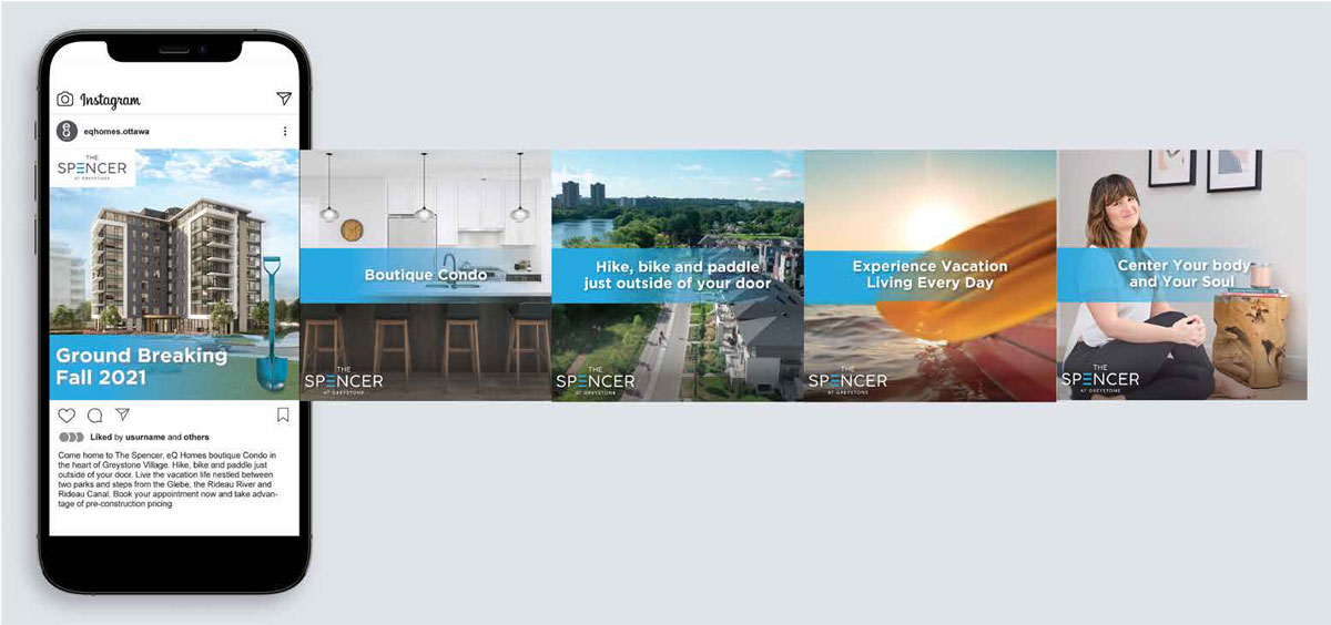
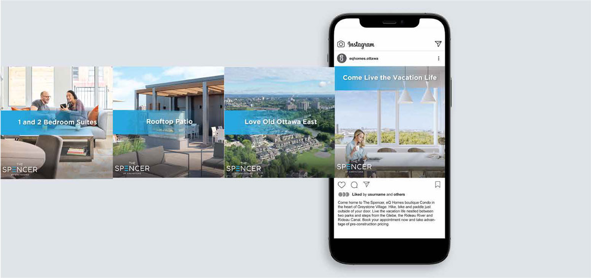
THE SPENCER AT GREYSTONE
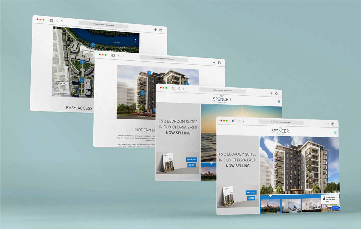
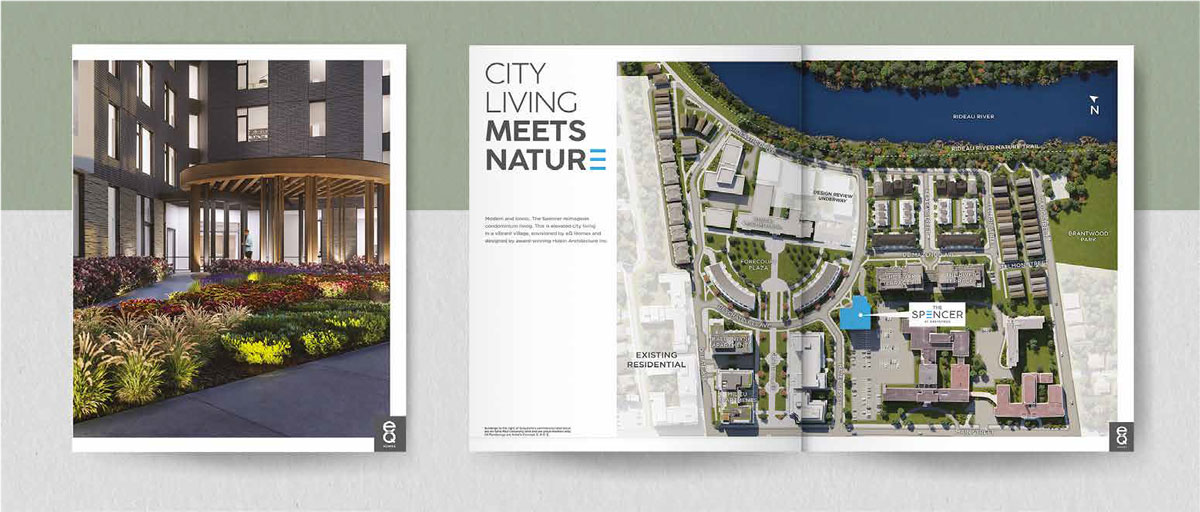
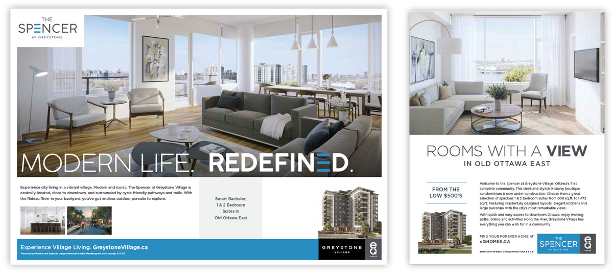
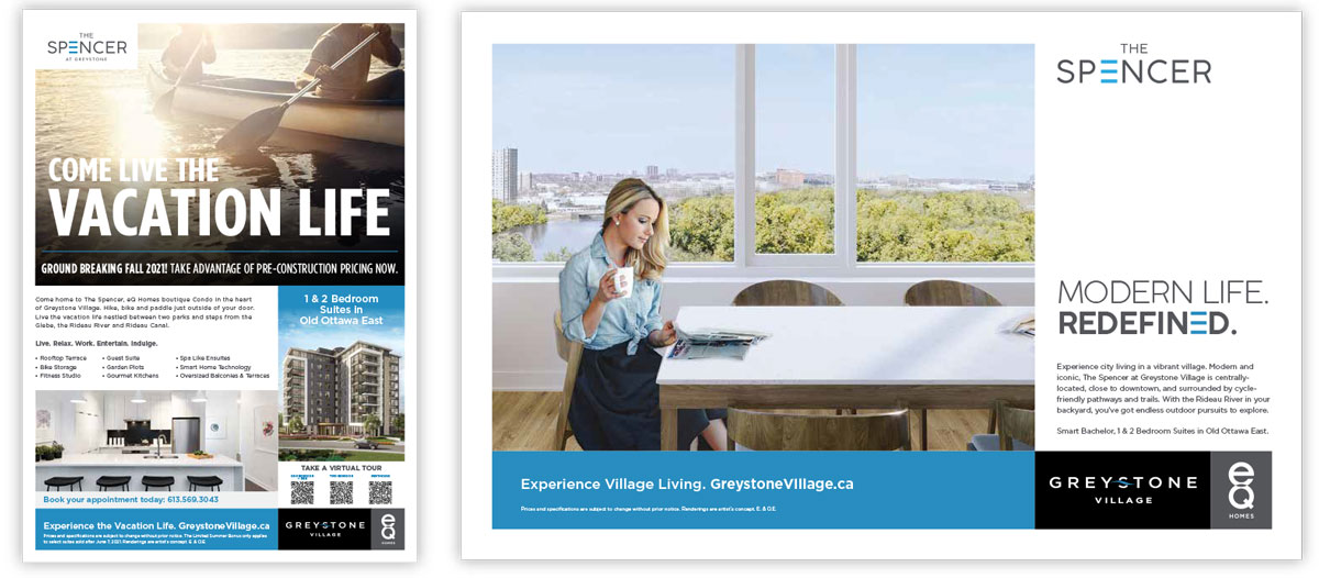
As the marketing agency behind the esteemed Seaton South project, our approach to branding is one of immersive storytelling and visionary design. Every element of the Seaton South brand identity is meticulously crafted to convey a sense of refined elegance and contemporary living. The logo, an emblem of unity and progress, combines fluid lines with a timeless font to reflect the seamless integration of community and innovation. The website, seatonsouth.ca, serves as a virtual canvas where visitors can explore the project's features, floor plans, and amenities. Our strategic use of high-quality visuals and engaging content paints a vivid picture of the exceptional lifestyle that Seaton South offers. Thoughtful typography and eloquent copywriting accentuate the project's unique selling points, from spacious layouts to its connection with nature. Our branding efforts for Seaton South are more than visuals; they tell a compelling narrative of a harmonious community where modern living coexists with the tranquility of nature. Through every touchpoint, Seaton South's branding speaks to the hearts and aspirations of those who seek a life that's as exceptional as it is balanced.