The Whitney On Redpath
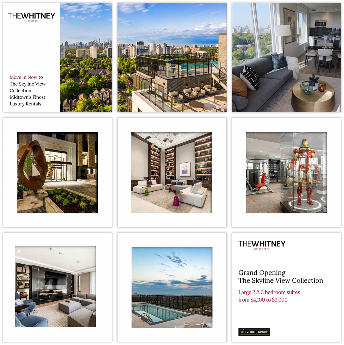
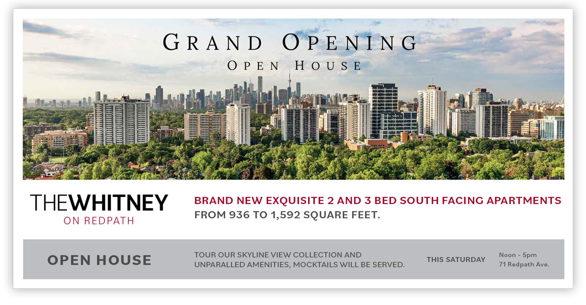
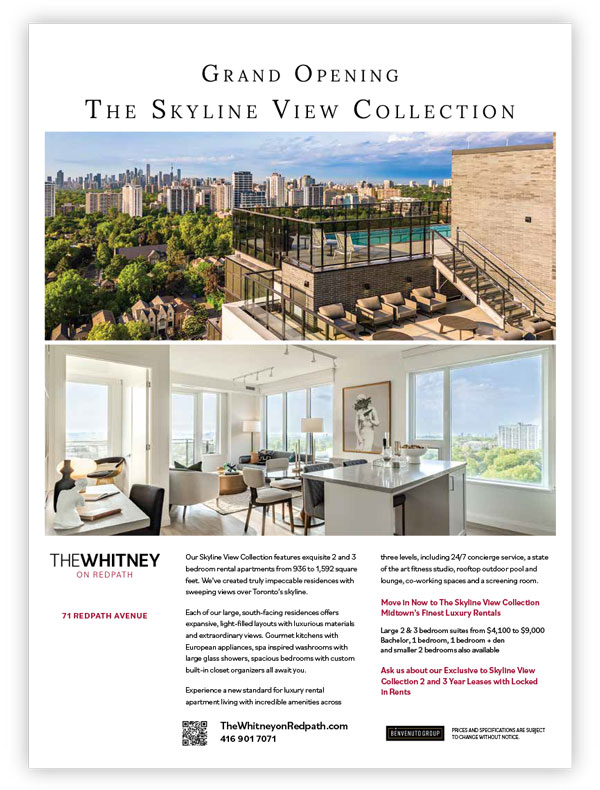
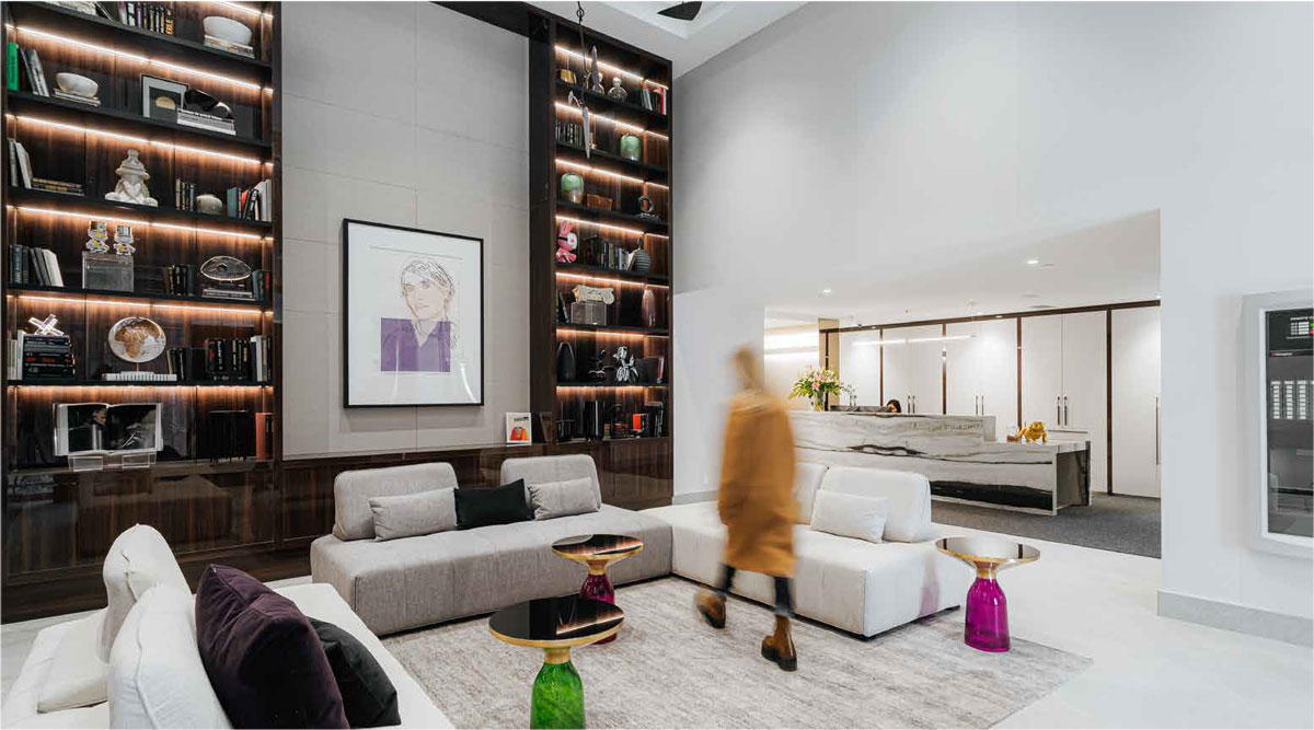
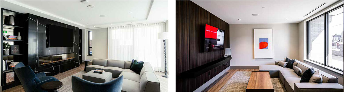
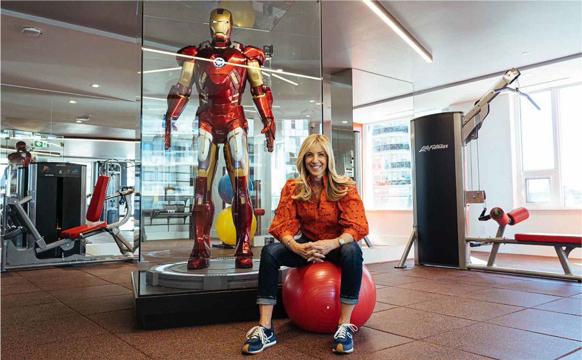
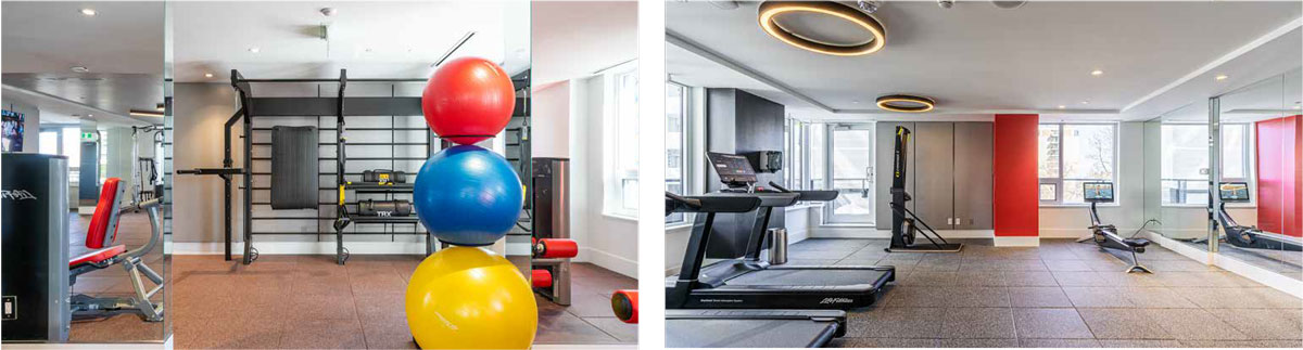
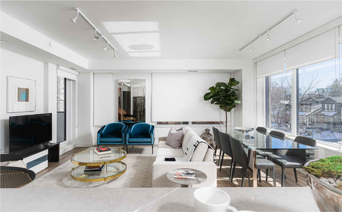
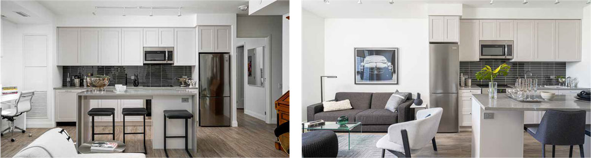
The branding of The Whitney on Redpath is a masterful blend of modern luxury and urban sophistication. The logo, characterized by its tasteful serif typography, embodies a sense of timelessness and prestige. The carefully selected imagery showcases the architectural grandeur and interior allure of the condominium development, painting a vivid picture of the lavish lifestyle it offers. The website's layout and design are meticulously crafted, fostering intuitive navigation and a sense of spaciousness with strategically placed white space. The language employed in the copywriting is both articulate and evocative, underscoring the exclusivity and allure of The Whitney. Each amenity, from the rooftop terrace to the fitness center, is depicted with striking visuals and concise descriptions, further enriching the brand narrative. Overall, the branding of The Whitney on Redpath artfully encapsulates the essence of a refined urban retreat, where every element harmoniously contributes to a lifestyle of elegance and sophistication.